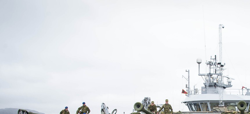
As part of NATO's Unified Vision 2014 exercise, a Norwegian artillery unit sets up its self-propelled howitzers. NATO
This Graph Shows How NATO’s Military Capability Has Evolved Since 1949
Three takeaways from the annual spending trends of each alliance member over NATO's 65-year history in 2011 U.S. dollars. By Janine Davidson
As representatives of twenty-eight NATO member nations convene in Wales for the 2014 NATO summit, there are a number of significant issues under discussion. One overriding concern, however, remains the proportional defense spending and overall military capability of the alliance. In order to provide context for this debate, we have visualized a publicly available dataset on military expenditures compiled by the Stockholm International Peace Research Institute (SIPRI). This graph traces, in constant U.S. 2011 dollars, the annual spending trends of each alliance member. To our knowledge, this represents the most comprehensive timeline of NATO’s 65-year evolution:
How To Use This Graph
This is a fully interactive visualization that can be freely embedded in other websites or shared via social media. It carries no parameters beyond a requirement of citation.
The size of the pie chart corresponds to the total, combined defense spending of all NATO member nations. Each individual slice corresponds to a specific NATO country. Military spending data are tracked in constant 2011 U.S. dollars, in millions. At a glance, it is possible to see the respective defense expenditures of each NATO member in a given year. It is also possible to see what percentage of this total is represented by the United States (e.g. in 1949, the U.S. constituted 68.94% of spending among NATO nations).
The timeline beneath the pie chart can be moved to display data for any year between 1949 and 2013. Moreover, the “NATO Nations” legend can be manipulated to selectively include or exclude specific countries from the visualization. This makes it possible to compare defense spending trends between any group of countries in the twenty-seven nation series.
Clicking on a specific slice of the pie chart will also show the “history” of that slice, illustrating at which points a nation’s spending is at its maximum extent (e.g. in 1989, France’s military spending was at a historic high; in 1992, it was not).
Caveats and Disclaimers
This graph displays the total military spending of each NATO nation—the alliance’s theoretic maximum military capability. This should not be conflated with nations’ contributions to NATO missions, which may be considerably smaller. Iceland, the only NATO member that lacks a standing army, is excluded from this graph.
Unfortunately, there is insufficient public data to unpack the NATO-specific commitments of each country. It can be assumed, however, that the relative NATO contribution of European nations with locally based militaries may be quite high. On the other hand, the United States, with a global military presence, may contribute a much smaller proportion of its total military power to NATO. In the event of a major European crisis, however, this capability could be reoriented accordingly.
Finally, it is important to note that defense spending is only one determinant of overall military ability—although it is a significant one. A comprehensive picture of NATO’s military evolution would require similar modeling of personnel and materiel. However, this graph provides a good place from which to launch additional inquiries in future.
What This Graph Tells Us
While there are numerous conclusions to be drawn from this data, there are several points that pop out immediately.
- In constant 2011 dollars, the total military spending of NATO nations in 2010 was greater than at any other point in the alliance’s history. This includes at any point during the Cold War.
- NATO defense spending was at its most disproportionate in 1952, when the United States constituted almost 77 percent of the alliance total.
- Conversely, NATO military spending was closest to parity in 1999, when the United States constituted 55 percent of total defense expenditures. This is likely due to thelong-term, muscular commitment that NATO made to stability operations in the Balkans. U.S. troops comprised only a minority of the NATO-led Stability Force, which oversaw Balkans reconstruction from 1996 to 2004.
Emerson Brooking, research associate for defense policy, contributed to this post.
This post appears courtesy of CFR.org.


